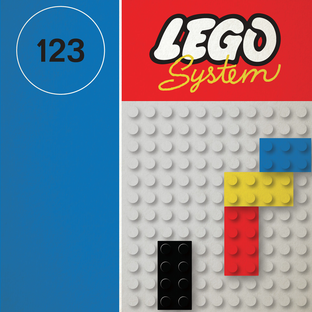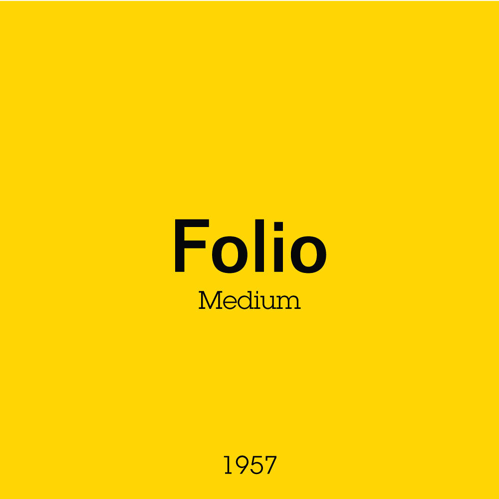
Folio is one of those typefaces that you often see but never take notice of. Much in the way of most ‘International Typographic Style’ typefaces, it emphasizes cleanness, readability, and objectivity. In this use-case, Folio was used for the set numbers as they were meant to be easy to read but not distracting from the overall box design. The numbers were the information, not the style of the numbers.
The boxes seemed to focus on the structure and system of the bricks, and what they were capable of creating from such a simple action highlighted in the circled fingertips. It showcases the precision, made true with the recent changes to the brick in 1963 when the material was changed from Cellulose Acetate to the superior ABS plastic.
An iconic box with the bricks on the side and the built scenes in the background. Seemingly more modern than last weeks post.
Next week as we reach closer to the final lineup, we’ll take a closer look at the first ‘International Standard’ box art.

