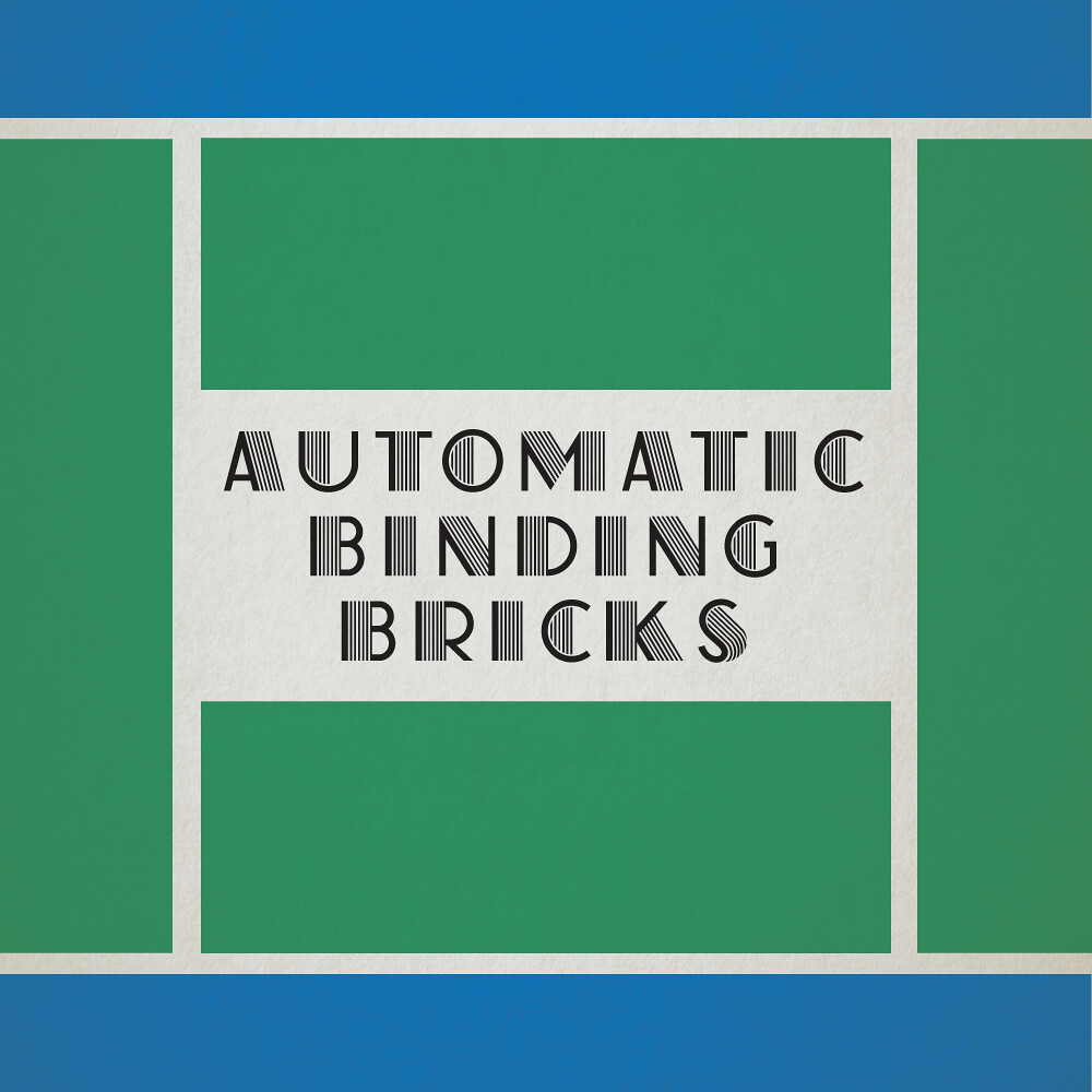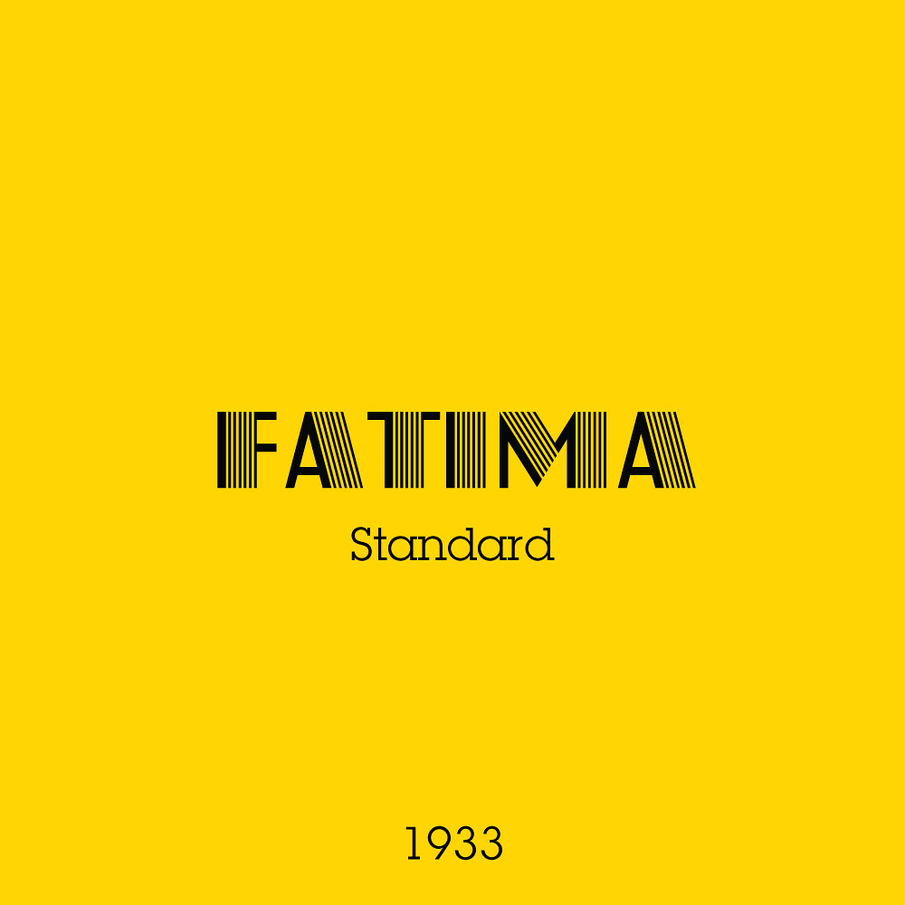
Nothing says luxury and prestige more than the enchanting styles of Art Deco. Fatima, a font designed in 1933 as a glamorous counterpart to a solid version released earlier that decade, looks like the Chrysler Building had kids with an alphabet. The most famous use of it would have to be 2013’s ‘The Great Gatsby’ poster. LEGO Wanted an eye catching upmarket type for its new bricks to set it apart from their wooden toy production.
The box itself isn’t so flashy, and is somewhat mismatched with the style of the type but still portrays an idyllic notion of life. Kids playing with their toys in the afternoon sun, not throwing LEGO at each other of course. This box outlays everything the LEGO company wanted it to be. A wholesome family toy, albeit one of prestige.
If you want to use this font, it was redesigned digitally as ‘Atlas’. I love what I believe they were trying to go for with this box, and I’d say they nailed it. It obviously got enough people’s attention to start something big.
Next week, the big finale. I’ve scoured the internet and the globe for specimens, prints, and history on the type used for the first LEGO logo.

