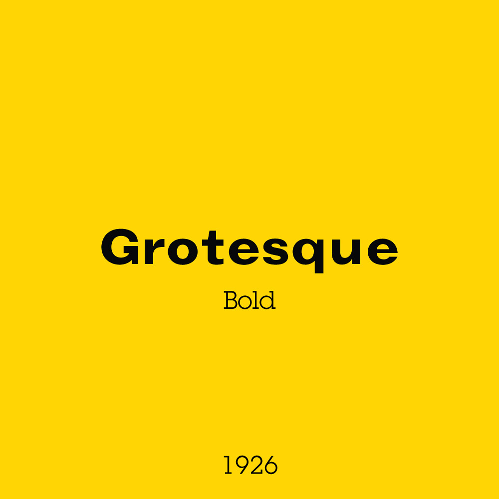
Good lord it took me a long time to identify this font. Turns out I didn’t realise how much difference there would be between the metal type used in this print and the digital typeface equivalent. Monotype Grotesque used to be rather popular before being usurped by 3 other Monotype typefaces seen in this series; Futura, Kabel, and Gill Sans. It’s a great early sans serif type example nonetheless.
The new logo and box was rolled out worldwide and it was a hit! It was no longer a kids toy on the box. It was a wholesome FAMILY toy. A number of bricks placed in the foreground also cleverly give the customer a bit of an idea on how the bricks might fit together. The border around the photograph almost gives a sense of the ‘picture perfect family’ that can be achieved when the whole family plays.
It’s such a traditional looking design and in my opinion is the best box to show someone when they ask what old LEGO was like.
Four more, are you still with me? Next week it’s going to get loud, visually at least! Pure shelf presence.

