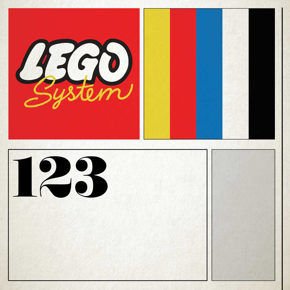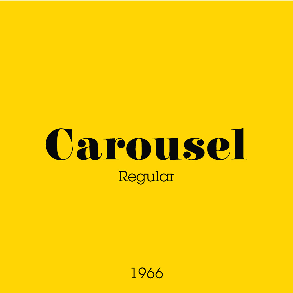
This era focused mainly on trains. Whether it be the carriages themselves, supplemental track sets, or accessories for a layout, almost all sets at this point in time were geared toward trains in some way or another. It’s no surprise then that the beautiful ‘Carousel’ fat-face type from the same year was used. Not only was it fresh at the time and popular for advertising, but it also bore resemblance to the numbers painted on train carriages through Europe!
The layout was a fairly well crafted series of structures designed to be replicated on any box size. The photographed contents on a dimly lit surface evoked the appearance of your living room table or your attic space play area. The boxes of this time were also some of the first to have a proper scheme for age differentiation with cute little stick figure family charts, showing how appropriate a set was for certain ages.
All of this allowed for some brilliant store displays in the toy aisle with a consistent and attractive presence. Certainly one of my favourites, and definitely a special time for 60s LEGO fans.
Next week I will edge closer toward the quintessential town plan boxes with the Universal Building sets!

