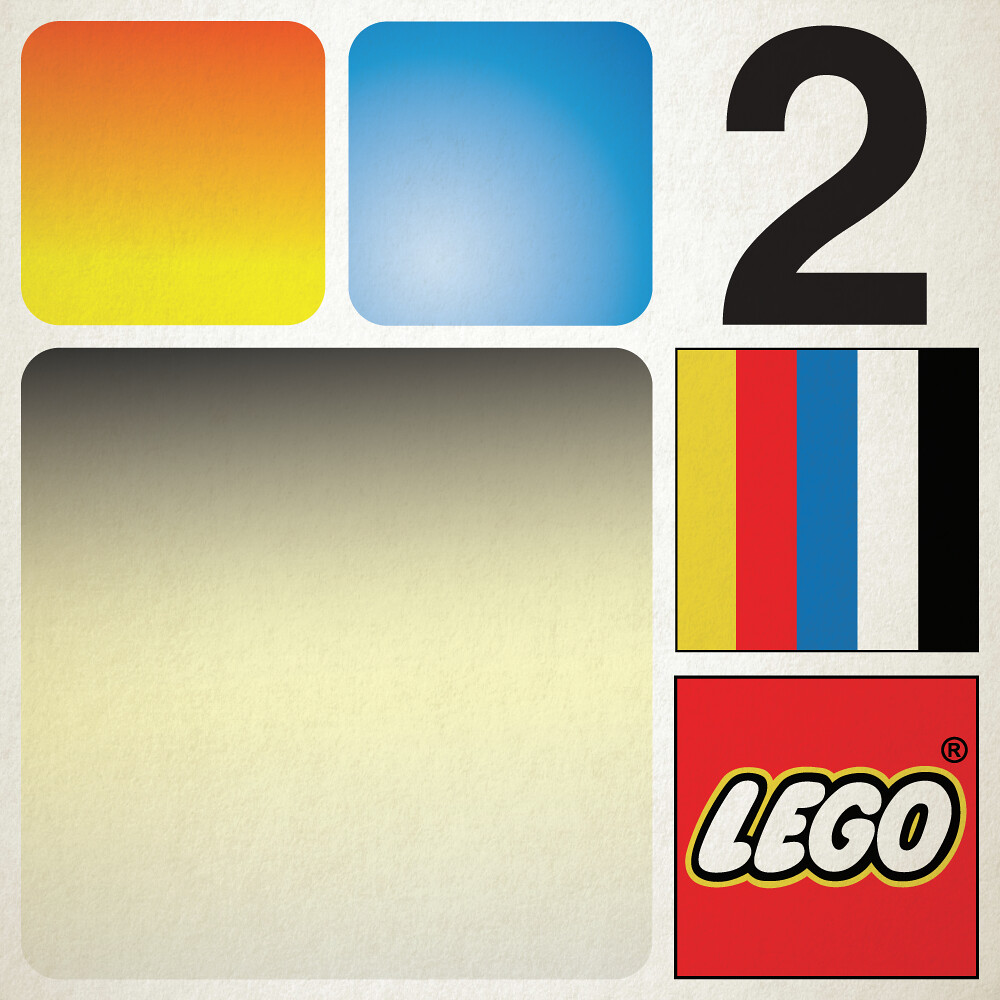
In my mind, 1973 solidified LEGO’s reign as a global empire. In years prior the company extended its reach to the far east, a new factory opened, a dedicated PR department was set up, and the licence agreement they had with Samsonite in the US had ended. In ’73, LEGO USA was established in the still standing Connecticut HQ, and the new logo came in to unify all LEGO media. It was here to proclaim that the company was here to stay and was ready for the future.
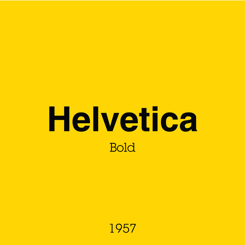
Helvetica became the house typeface with ‘Legoland’ sets, ‘Universal Building Sets’, and the new LEGOLAND Sierksdorf park entrance all sharing the swiss-type staple. This and a grid structure that allowed all box sizes to follow suit meant consistency at a global scale in media, marketing, and retail presence.
This now marks the beginning of the modern era for LEGO box art. You with me so far? We’re half way there! Onward to the old stuff 😃
Next week I will reintroduce to you the charming train era, with one of the funkiest type choices seen so far!


