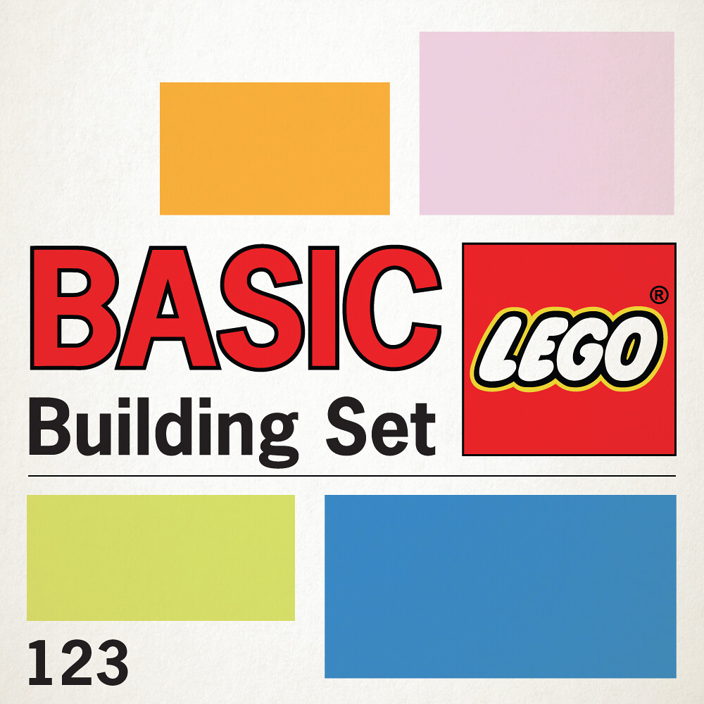
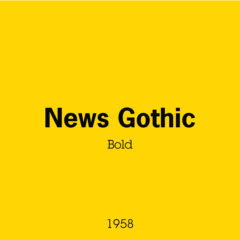
If you’ve ever seen the ABBA logo, you’ve seen News Gothic. In this use case, the font was perfect for the box in that it shared the qualities of the theme, a basic, easy to understand system. It’s readable, it’s no nonsense, and being relatively unknown to the public or entry-level designers, the potential of critique is rather minimal. It was just simple.
The box itself became a bit of a collage of the set information, set contents through the nifty window, and a plethora of build suggestions and ideas scattering the entire net of the box. Instead of backgrounds, the designers just used solid blocks of colour. I’m imagining there was at least some system in place for colour choice, but aside from a slight grid system, it all seems just a bit much.
I tried to see what was happening internally at the time around the early 80s to see why this aesthetic might have been lacking compared to previous and future reference, but it looks like 5000 people were employed in 1985 so surely someone could’ve put there two cents in!
Next week we are at the end of the first half and checking out the 70s. Getting closer to the really special stuff!


