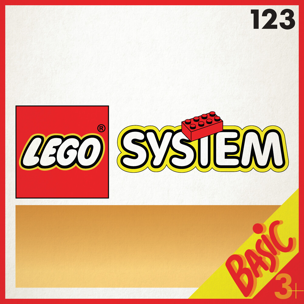
Futura my guilty love showed itself in this box art. It had been used previously in this same Basic range but I chose to focus on the first sets with the System graphic, an iconic feature of this age. Futura is the ‘go to’ clean modern typeface and its sparing use solely for the numbers and production info on the boxes allowed it to sit neatly with the rounded lettering seen elsewhere on the box.
With all the different previous iterations of design in this theme the box became cluttered so easily. Shadowed backgrounds became superimposed gradients, the age guide was pushed all the way down to make room for the Basic tag that was kicked off its pedestal once LEGO System came in. Everything felt like it was just band-aiding older styles.
You can see what a difference this and last weeks Basic set have between them, but I suppose it’s a good point in the evolution of the Basic range. They had to reform at some point. Like Thanos, it was inevitable.
Next week the origins of the Basic theme will be uncovered as we hit the 80s, colour and all.

