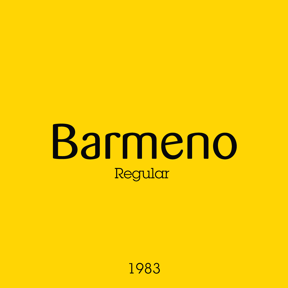
Refined. Sophisticated. Wholesome. LEGO Bricks for a modern market. I don’t think there’s ever been an era where box art was more an advertisement for the brand than an advertisement for the set! FF Barmeno was a font family from 1983, widely popular in the marketing world at the time and still in use. You may have seen its edgier cousin FF Dax used in the logo for How I Met Your Mother.
The curving bottom section of the box is about the only feature that kind of stuck as discussed in previous weeks. The rest of the box consisted of a picture of the piece included in all their glossy goodness, speaking to their quality and craftsmanship if that’s applicable. I can see what they were going for, but I’m so glad that in the next wave of sets they added more to the backgrounds. It was at least a break away from the traditional grid structure and segmented layout of previous themes.
Whats more is that 1998 was the year LEGO launched their updated logo, the one you still see today. It was also more refined than its predecessor, and better for digital use. I think this time was a clean slate for the company’s visual identity, and I believe this was for the better.
Next week we go full 90s with the beginnings of the System graphic, and the end of the grids!

