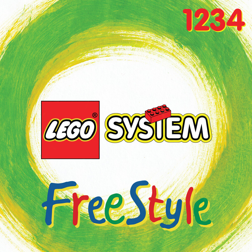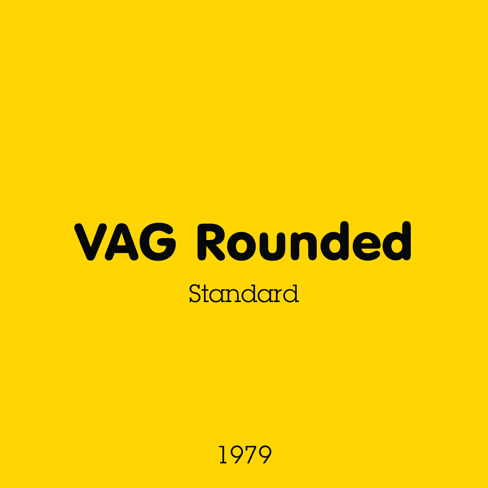
If you hadn’t noticed, both the SYSTEM graphic and the set number bare the same typeface! VAG Rounded was a typeface commissioned for Volkswagen in 1979, to be to type what the Beetle is to carparks. It’s friendly, approachable and welcoming and once it was public ten years later, it became rather popular due to its inclusion on a bunch of software. Think Comic Sans, but classier =P.
You could not get a more ‘juvenile’ design style unless you stuck some Cooper Black fridge magnet text on the background! This theme was meant to be the embodiment of the ‘just roll with it, have fun’ idea LEGO often enjoys. Think of this as Building Bigger Thinking’s little brother. A hand-painted (and digitised) background, brick piles, hand-written theme name, and a wonderfully round set number font all combine to create this vibrant and kid-friendly box art. The essence of this style could still be seen in last weeks post, the early Creator sets. Something this striking was needed to lure kids away from the video game aisles in the late 90s.
Everything in this design says ‘Look at me’, but not in an obnoxious way. It speaks to a more casual, fun-filled adventure of building, trying to reassure that the system isn’t so restrictive.
Next week is a stark contrast in its approach. It’s far more… basic.

