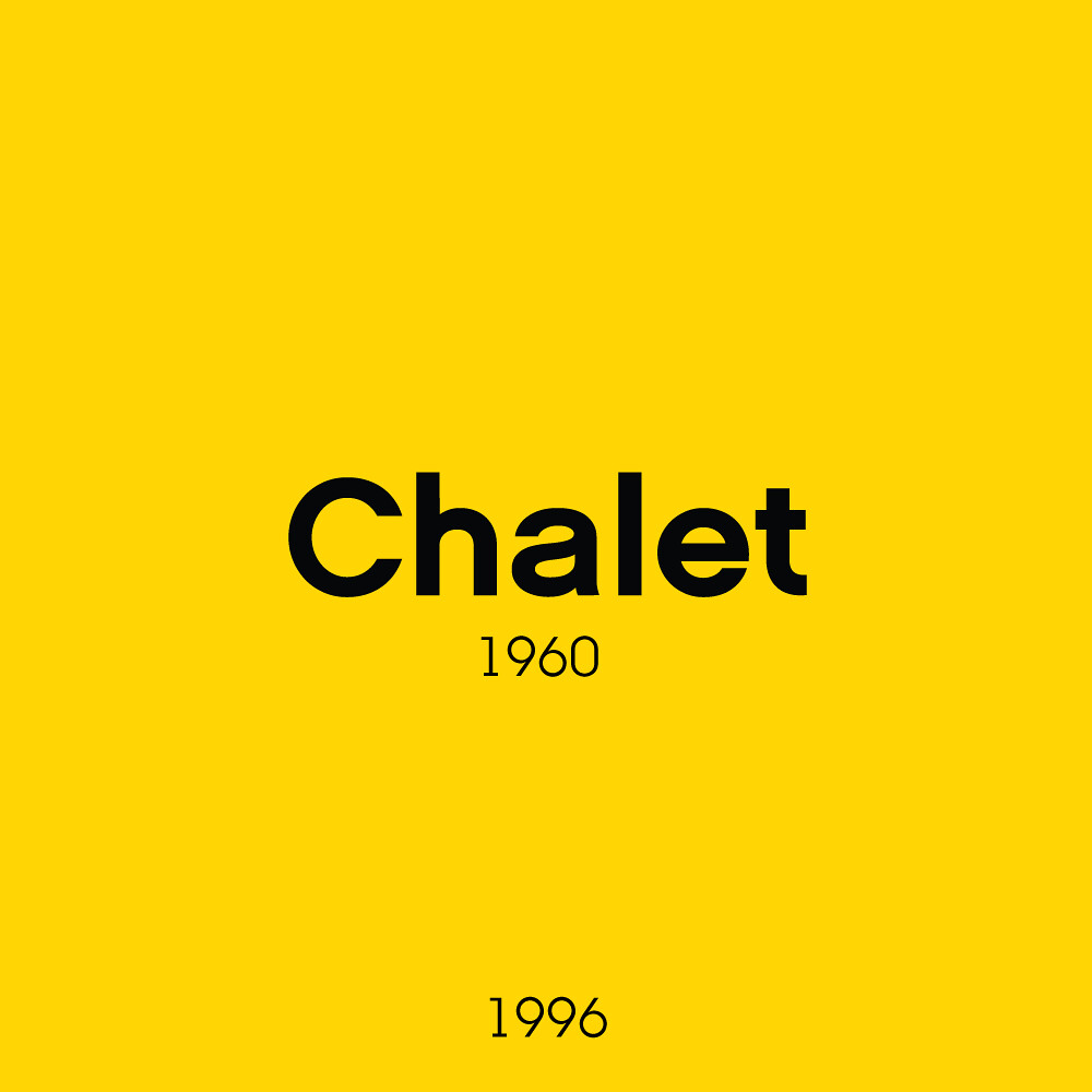
Have you ever wondered what font was used on LEGO Boxes? Chalet! Have you wondered what was used on any official signage for that matter? Chalet! Anything to do with internal communications and official press material? Chalet, released in 1996 is the company’s current font family of choice and it all started in 2002 when Chalet ‘NY1960’ was first used on boxes. This was a way to standardise and simplify the design process for this sort of material, in a time when the company was overcomplicating many processes. With a full condensed to extended family, Chalet allows consistency in its flexibility.
I dare say this may have been one of the changes former CEO Jørgen Vig Knudstorp put in motion, as was his approach at the time to streamline workflow and production.
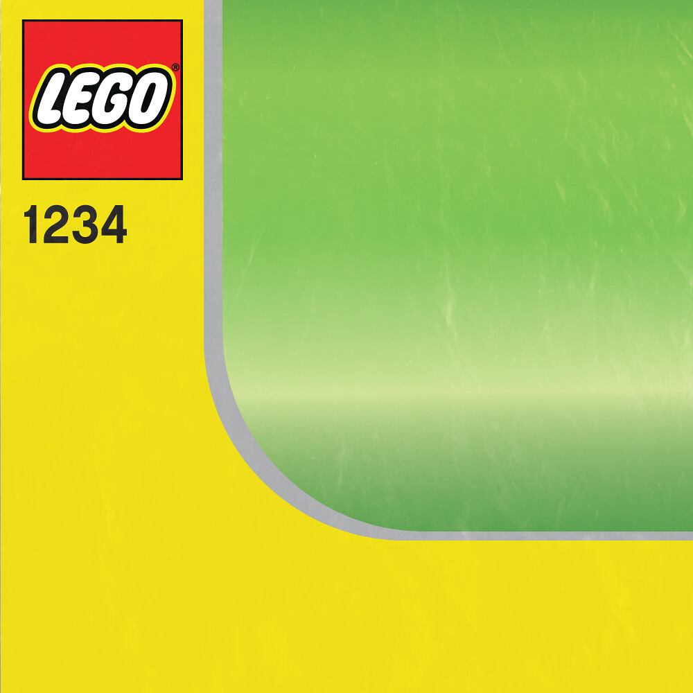
The bar of one unique colour brackets one or more edges of the front of the box to show what theme it comes from and a dynamic background breaks through from the rear. You will find it’s only been within the last couple years that any change has been made away from this layout standard, both in Creator and other themes.
Next week I’ll be looking at the box that set the standard for the standard, the first Creator sets!


